Kerning is the process of adjusting the spacing between individual characters in a font. This is done to achieve a visually pleasing and balanced appearance of the text. But as with most things, every now and then, things can go wrong.
Put the symbols too close or too far from one another and you end up with awkward or humorous typography. For example, if a company wanted to make a poster advertising their “cleaning” services but made the spacing between the letters “c” and “l” too tight, it can create the word “dining” instead.
The funny part is that such mistakes are more common than we might think. And the Facebook group ‘The Real Crime Is That Kerning‘ has all the proof. Here are some of their finds.
#1 Fail

#2 Finals

Design is full of detail-level concepts that matter more than their superficial simplicity would suggest, and kerning is a great example. When used effectively, it can be a powerful tool to influence aesthetics and communication through type.
It’s one of those things that, when used well, shouldn’t be noticed by the average reader.
“If you start to look for it,” designer Madeline DeCotes said, “you’ll realize there’s so much more to letters than you thought possible.”
#3

#4 We Are Open

#5

Unlike tracking, which adjusts the amount of space between the letters of an entire word in equal increments, kerning focuses on how type looks — creating visually pleasing and readable text.
Typeface designers build spaces around each letter, and sometimes between pairs of letters. But as we can see in the pictures, those spaces don’t always work in all situations, especially if you’re using a typeface in a way the designer didn’t foresee.
That’s when manual kerning comes in. Because beauty is in the eye of the beholder, no two kerning jobs will be the same.
#6 Dishwasher

#7 If You Go Hiking In The Bamboo Forest, You Better Check For Ticks

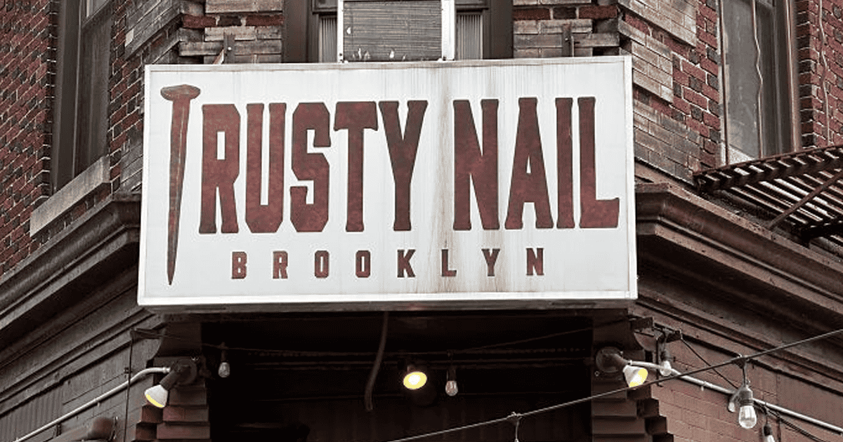
#8 In Nails I Trust

#9 The Real Crime Is You Knew Darn Well What That Looked Like And Sent It To Print Anyway

“Kerning is a strikingly subjective art form,” DeCotes explained.
“The designer needs to look at the space between each letter in a word and ask, ‘Does this look like enough space? Does it look like too much? Are the letters too tight?'”
#10

#11 Apply At..???

#12 Car Pets Are The Best Pets

#13

Bad kerning is so common that graphic designers even have a name for it: keming (which looks like kerning has itself suffered from bad kerning).
If there were hard and fast rules around kerning, every font would automatically generate perfectly kerned character pairs. But because kerning is in many ways a subjective pursuit, the only thing anyone can say with certainty is that kerning is bad if it renders something unreadable.
This leaves a lot of (or a little) space for interpretation.
#14 Good Job, Walmart. If You Could Just Schooch The “Gurt” A Little To The Left

#15 Wot & Who?

#16 Pudding Turkey!

#17 I Love Le Cher (French Department) vs. I Love Lécher (To Lick)

Not every project requires kerning by hand, but there are some instances when it may be better off if you give special time and attention to this detail:
Headlines. Document headlines—or any time you make a font a larger point size in your document—can change the way the font kerning looks. You may find that you need to adjust the kerning of a headline to make the characters appear to have the same space between them as they do at a smaller point.Large formats. Like headlines, large-format projects—think banners and billboards—can create kerning issues. This is because, at smaller point sizes, characters need more space between them to be legible. When that same font is blown up to billboard size, kerning that once made it easy to read now makes it look a little sloppy. This is the perfect time to kern by hand.Logos. Creating a logo that includes typography requires special consideration for kerning. Not only is it a matter of taste and preference, but you must consider the myriad sizes in which your logo may be printed. #18 Shampoo

#19 W Hyy Yyyyy???

#20 I Guess It’s More Font Choice, But The High School That My Girlfriend Teaches At Is Fort White High School, But All I See Is Fart White In Their Gym

#21 Some Are Neon The Kerning Thing

“If you’re not a designer, it’s not something you think about,” DeCotes said. “People don’t realize anytime they see giant text, whether it’s on a poster, a billboard, or a website, headline fonts have probably been thoughtfully kerned.”
Assuming it’s been executed well, of course!
#22 Nope I’ll Get Mine Done Somewhere Else

#23 He Is Trisen

#24 6nly Sod Gan Gugjmel

#25 It’s Rush Because Go Time!

#26 Finally Found One In The Wild!

#27 Amazing Pizza. Atrocious Kerning

#28 Cool Craft Bar In Richmond

#29 I Just Saw This In A Market In Georgia Today And Could Not Stop Laughing. You’re Welcome

#30 Finally Found Something

#31 Please Don

#32 Found In The Wild At Our Local O’charley’s

#33 A While Ago I Was An Extra On The Last Of Us, And I Had To Wait To Share This

#34

#35 Today I Learned That Automotive Professionals Are Not Typesetting Professionals

#36 Love It!

#37 Chips

#38 Saw In The Wild And Thought Of You All

#39 Something I Hated Today

#40 The Closer You Look, The Worse It Gets
